Hurricane Hugo is remembered as a rare and unique hurricane, in the sense that it primarily affected the Southeastern United States. It originated off of the western coast of the African Continent around September 9, 1989. It became a tropical depression on September 11, and a hurricane on September 13. The hurricane made landfall in the Virgin Islands on September 17, and gradually continued towards coastal regions of the state of Georgia. An "upper cyclone" in coastal Georgia caused Hurricane Hugo to divert towards the north-northwest; it made landfall off the coast of South Carolina on September 21st.
The map above (taken from the NOAA archives) charts the course and intensity of Hurricane Hugo over the course of its lifespan. At one time Hugo was a category five hurricane; it hit South Carolina as a category four hurricane. 82 deaths were attributed to Hurricane Hugo, and its estimated damages amassed to over $17.4 billion. Eastern Carolina reported the overall storm surge to be over 20 feet.
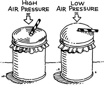
Barometers are used to measure pressure. The figure above illustrates a homemade barometer, specifically how it functions at relatively high and low pressures. To construct a homemade barometer, a flexible medium (such as a balloon) is stretched over a container of some sort. It is secured around the container, and then a section of a straw is taped atop the medium, so that it points out horizontally. Additional details on barometer construction may be found at the video link below:
Though inexpensive when compared to more "scientific" barometers, homemade barometers have a disadvantage: durability. The following picture was taken after two weeks of a barometer's use. This malfunction could have likely been rectified through a smaller glass container; the balloon would not have been under nearly as much stress/ strain.
The following figure was created by periodically observing the sun's relative position to the horizon over Macon, Georgia. The observations were made on October 29, 2012.
The figure is drawn from the perspective of looking down upon the earth. At the various times listed on the diagram, the sun's relative position on the horizon/ landscape has been plotted. Although the date of observation has been included on the diagram, it should be noted that the total daylight time is less than twelve hours. The "Autumnal Equinox" marks the point at which days begin to grow shorter than twelve hours; an observer would be able to surmise that these data were collected on an Autumn day.
Windrose plots are a graphical method of protraying wind patterns over a period of time at a specific location. Numerous wind monitoring stations are located across the country; free data from each station can be obtained at the Lakes Environmental Web Site.
The following widrose plots were constructed from the WRPLOT software, which is also available from Lakes Environmental. Figure 1 demonstrates the wind pattern distribution in Macon, GA on July 17, 1991; the graph is directional, meaning it shows from which direction the wind was blowing.
Figure 1
Figure 2 demonstrates the same information as Figure 1, with the exception of direction. Figure 2 depicts a flow vector; to which direction the wind was blowing.
Figure 2
Figure 3 depicts the yearly average wind data in Macon, Georgia throughout the 1991 calendar year. It is formatted to demonstrate from which direction the wind was blowing.
For more information about wind monitoring and windrose plots, see the EPA's site at epa.gov.
In the study of meteorology (as well as numerous other branches of "earth sciences"), cartography (map making) plays an important role. Four elements are common to all types of maps: a title, a legend, a scale, and an orientation (i.e. a compass rose). The following examples are a variety of maps which prove to be useful in meteorology, with a brief exposition on each.
Chloropleth maps use shaded/ colored regions to symbolically represent the distribution of a variable. For example, in the map above (taken from Colorado Cartographics LTD.), the estimated household income for the 48 contiguous United States is represented. Darker-shaded states represent higher income levels, while states which receive a lighter shading denote lower household incomes. While this map has a proper title, legend, and orientation, it is missing a scale.
"An isopleth map generalizes and simplifies data with a continuous distribution." (http://www.aegis.jsu.edu/mhill/phygeogone/isoplth.html) This example, taken from the University of Illinois at Urbana-Champaign, is a specific example of an isopleth map call ed an isotherm. It uses continuous regions of color to denote the surface temperature over the United States and Canada. A second example of an isopleth map, called a topographical map, illustrates the elevation profile of specific regions. Topographical lines (often abbreviated as "topo" lines), make such cartography possible.
Topographical rendering of Springer Mountain and surrounding area. I live here!
Dot density maps are another type of useful cartography. Dot density maps use the presence of a "dot" or other symbol to represent a variable. For example, in the following example of a dot density map, the presence of a dot in a region represents the presence of 100,000 people.
Though the map contains no title, scale, or orientation, valuable information can be gleaned from the legend alone.
Similar to the dot density map is the proportional symbol map. Rather than using a series of one-sized dots to represent a variable (i.e. population), a proportional symbol map uses various sizes of the same symbol to represent a variable. In the following example, taken from TMap , the 1990 population distribution of Africa is represented.
The last map type which will be shown is the environmental sensitivity map. NOAA defines an environmental sensitivity index map as one which "provide[s] a concise summary of coastal resources that are at risk if an oil spill occurs nearby." Various forms of symbols and shading are used to denote the at-risk resources, both human and environmental.
AND, as a bonus, check out Hurricane Emily's movement from 1993 (video provided by GFDL/ NOAA)!